Opponents to action on the climate crisis have used various strategies over the last 25 years including denial (‘there is no climate crisis’), claiming it isn’t man-made (‘the climate has always been changing’), spreading doubt (‘the evidence isn’t strong enough to justify action at this point’) and claiming a lack of scientific consensus (‘climate scientists are divided on the subject’). As public opinion has moved slowly in favor of climate action, a new approach seems to be taking over, especially in the US; to claim meaningful action would cost too much economically and / or socially (‘job killing laws kill growth’ or ‘you can’t take people’s freedoms away’).
Countries, especially the US, absolutely ought to take decisive actions on the climate crisis now, whether there is a small short term decline in wealth or happiness or not. But is there really any evidence that taking effective climate actions reduces a country’s wealth or happiness? I went through some well-respected data carefully and I found countries taking more action on climate change tend to be happier and wealthier than those that take less.
The Data
You can see the full data in the spreadsheet here. Analyzing the data involves correlating data – if you’re unfamiliar with this, there’s an explanation at the bottom of this blog entry.
Climate Change Action
The Climate Change Performance Index is an independent monitoring tool of countries’ climate protection performance. Each of 58 countries receives a score from 0 to 100 that represents the effectiveness of their efforts to take action against climate change using a complex formula that includes emissions and climate policy. The list is topped by Sweden with 75.77 with the USA is in last place with 18.60.
Happiness
The World Happiness Report (also summarized on Wikipedia) is a UN report ranking 156 countries for happiness. Each country receives a happiness score from 0 to 10 that is produced from a survey of the population; values actually range from 2.853 for South Sudan up to 7.769 for Finland. There is a lot of extra data in the report – e.g. analyzing things that contribute to the happiness – but I only use the happiness score.
Economic Equality
It’s not unreasonable to ask if a country that pursues climate justice also pursues economic justice, so I have included the OECD data on countries’ income (not wealth) inequality. I actually used two different measures. First, the Gini coefficient – this is a number that goes from 0 (meaning total equality of income) to 1 (meaning total inequality as in 1 person gets everything); values went from 0.24 (the Slovak Republic and Slovenia) to 0.46 (Korea). Second, the ratio of the income of the richest 10% to the poorest 10%; here the values range from 2.9 (Denmark) to 6.7 (Mexico).
GDP Per Capita
Since we are interested in the economic cost or benefit of climate change action, we also include the World Bank’s data on GDP per Capita. This is based on PPP, which means it also takes account of the price of products in the country concerned, and essentially reports the GDP in 1000s of US dollars.
The Countries
I included 28 countries in this test; to some extent, they were self-selecting as they had to be in all 4 data sources. But I wanted to concentrate on medium-to-large, well developed, somewhat prosperous countries because they contribute most to climate change. So very small countries and poorer or developing countries are deliberately under represented. My full list is Australia, Austria, Belgium, Canada, Czech Republic, Denmark, Finland, France, Germany, Hungary, Ireland, Italy, Japan, Korea, Mexico, the Netherlands, Norway, Poland, Portugal, Russia, Slovak Republic, Slovenia, Spain, Sweden, Switzerland, Turkey, the UK and the USA.
The Results
Happiness vs Wealth
Can money make you happy? I hope you would be suspicious of any statistics that suggests otherwise! As a basic test I produced a scatter chart of Happiness vs GDP per capita for the 28 countries.
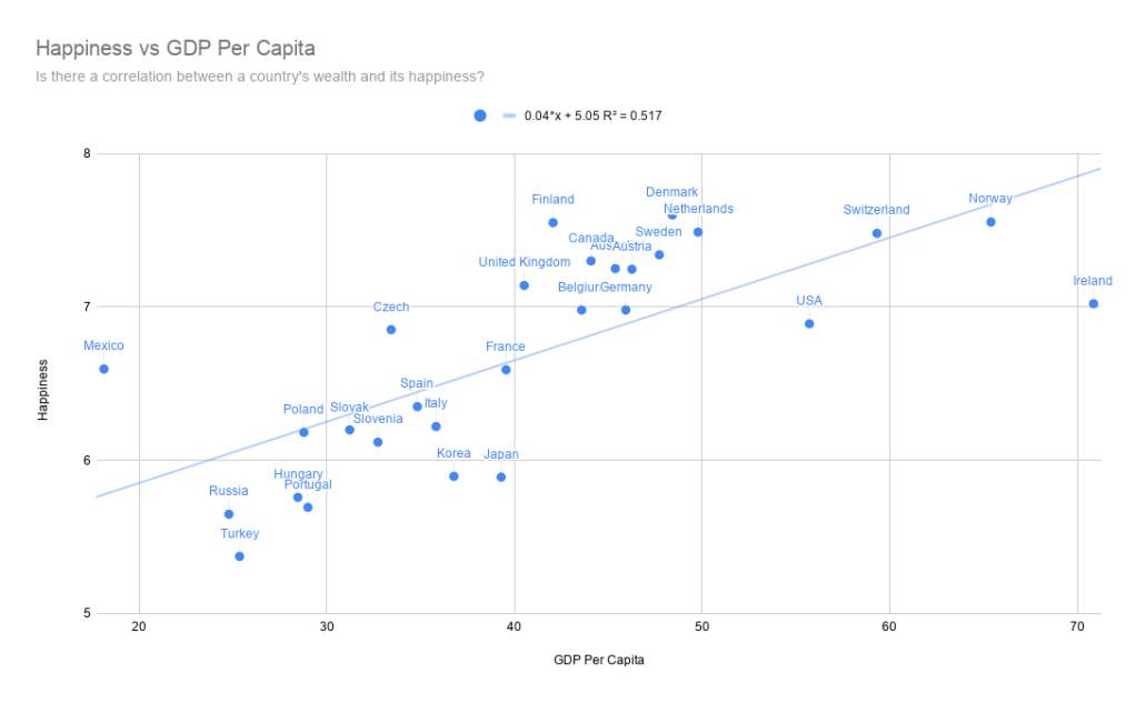
The chart shows a very strong positive correlation between a country’s happiness and its GDP per capita. The value of R squared is over 0.5, which can be interpreted as meaning “over half the differences in countries’ happiness can be explained by their GDP per capita”. You can see outliers where countries are far away vertically from the trend-line (e.g. the USA and Japan are ‘less happy’ than their GDP would suggest, while Finland and Denmark are ‘more happy’).
This correlation between money and happiness doesn’t prove that ‘money makes you happy’ but it’s compatible with that hypothesis. There are other possible explanations for the correlation – e.g. ‘happy people are more economically productive’ or some hidden data point (e.g. how healthy a country’s population is) causes a country to be both happier and more productive.
Happiness vs Climate Change Actions
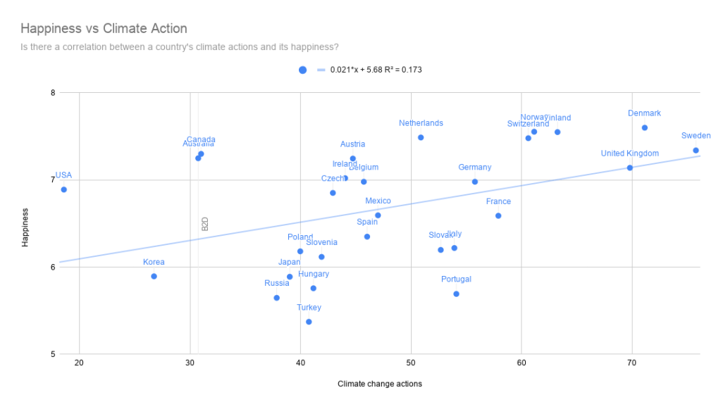
Here you can see a moderate but positive correlation between the effectiveness of a country’s climate change actions and its happiness. For whatever reason, countries that act on climate change tend to be happier. Because the correlation isn’t strong, there are several ‘exceptions’ far from the line; e.g. the USA, Canada and Australia are all happier than their climate change actions would suggest, whereas Portugal and Turkey are unhappier.
Correlation is not causation! It’s possible but unlikely that the climate change actions have directly made countries happier; it’s also possible but unlikely that happiness has caused the countries to take action on climate change. It’s more likely that some countries have a characteristic (e.g. social responsibility) that prompts them to adopt policies that promote happiness (e.g. a good welfare system) and minimize harm to the environment.
But the important point here is the correlation is positive; there is no evidence that taking effective climate action makes a country less happy.
Climate Actions vs Economic Equality
Correlating climate actions with income equality shows a weak to moderate positive correlation (the coefficient is between 0.33 and 0.51 depending on whether you use Pearson or Spearman and which income equality measure – Gini vs 10% – you use). In other words, climate justice goes with economic justice.
Climate Actions vs GDP Per Capita
Correlating effective climate actions with GDP per capita shows a very weak or weak positive correlation between countries actions on climate change and their GDP per Capita; the Pearson coefficient is 0.18 and the Spearman coefficient is 0.29. (In fact, the GDP figure for Ireland (over $70K) is highly suspect; it’s inflated by its collusion in tax avoidance by American hi-tech multinationals; EU income is funneled through Ireland, artificially increasing its GDP (and presumably reducing other EU countries’ GDP); using a credible value for Ireland’s GDP boosts these coefficients to 0.23 and 0.32. )
In other words, there is no statistical evidence that effective climate change actions reduce wealth, if anything, the statistical evidence suggests the reverse.
The Conclusions
Countries that take more effective climate change actions tend to be happier, wealthier and more economically equal than those that take less effective actions.
Why?
That’s hard to answer definitely but here’s what seems to me the most credible explanation.
First, countries that take more climate actions also tend to invest more heavily in their population (e.g. providing better welfare, education, transport and healthcare); this increases happiness and requires higher taxation (producing more income equality); and the provision of transport, healthcare and education reduces spending in those areas thus boosting people’s purchasing power (and hence our measure of GDP). Virtuous countries tend to see the big picture and this makes the population happier and wealthier.
Second, countries that take fewer climate change actions tend to act more for the benefit of business (especially big carbon) than their population. They spend less on their citizens (e.g. on education and healthcare) and can keep taxes lower (thus having higher income inequality). As a result, the population has to spend more of their income on healthcare (which can be very expensive when you buy it as an individual), transport and education, thus cutting their purchasing power. The relative lack of welfare and public healthcare support also increases stress on individuals and reduces their happiness.
Are there alternative explanations?
There are many explanations for the statistics, and some will be favored by deniers or skeptics. For example, maybe the countries that have taken effective climate actions have done so because they are already terribly happy and wealthy! These countries can afford to take actions – and accept reduced happiness and wealth as a result – but mere mortals like the US or Australia can’t afford to do so. This can almost certainly be rebutted by looking at historical data to see if countries wealth and happiness declined when they started taking effective actions (though the data for world happiness only goes back to 2012).
Another explanation is that countries and populations are ‘just different’. Maybe Scandinavians are just happier people, more willing to accept new inconvenient laws and still find ways of earning money than Americans, who would object to any such inconvenience and fall into poverty as a result? So while something works in some countries, it couldn’t be applied elsewhere. This is a reverse form of American Exceptionalism and I don’t believe it for a second. There are lots of ‘technical’ challenges to effective climate action in the US: distances are greater; towns have been designed around cars; public transport infrastructure is poor. But it’s the control of big carbon over politicians and the media – and not those technical problems or the attitude of US citizens – that has prevented effective climate action in the US.
Another approach is to question input data – after all, it’s very difficult to produce data on happiness or the effectiveness of climate change actions. You can easily debate the methods used or some of the resultant data points (e.g. is Mexico really a happier country than Spain?, should the UK really be third most effective country in the world in terms of climate action?). While I’ve doubts about some of the data points from all the sources I’ve decided simply to trust the reports (because they are all well-respected) and use the data ‘as is’.
And, of course, I may well have made a mistake in my statistics!
So taking climate actions will make a country happier and wealthier?
Not necessarily. The climate action data is measuring the effectiveness of a country’s climate actions. Doing something crude or ineffective (e.g. doubling the price of fuel) is unlikely to have much benefit on the climate crisis or to make a country happier or wealthier.
You have to consider a country’s happiness – which is related to wealth – to produce effective climate actions. Some individual actions may be unpopular, but they provided they are packaged up so the overall effect is positive the public will understand if they are presented properly.
An Introduction to Correlating Data
(The rest of this blog entry is for those unfamiliar with data correlation, you may want to stop reading at this point).
Correlating data is one way you can look for hidden patterns or causes in complex data sets. Let’s say you want to understand what most influences a graduate’s starting salary. You might have a set of data for many students that includes their starting salary, their SAT scores used to enter university, their GPA (i.e. grades) at the university they attended, how each student rated the quality of their university education (a mark from 0 to 10), the admission rates for each university and whether the graduates were admitted as ‘legacy’ students (i.e. admitted more easily because a parent was a student).
By putting all this data in a spreadsheet, you can correlate parts of the data. A simple way of correlating two sets of data is to plot them as points on a scatter chart; if the points form a straight line, they are strongly correlated and if they correlate very weakly they seem random. You may find that there is a very high correlation between a student’s SAT score and his starting salary and also the student’s university’s general education rating and his starting salary, but the other data points don’t correlate strongly to the starting salary. At this point, you can only speculate on cause (correlation is not causation) but you have some data to work with.
You would probably want to correlate entry SAT scores with university ratings to decide if they are two separate factors influencing starting salary or really one thing (maybe higher rated universities only select students with high SAT scores); legacy admission data might also help here. You might also wonder if a more highly rated university gave a better education and this better education was detected by the graduates’ interviewers, thus resulting in a higher starting salary. Or you might speculate that the interviewers felt a higher starting salary was needed to attract a graduate from a more highly rated university. In any event, it’s likely that further analysis of the data can provide some insights (e.g. if GPA is not really a factor, the second hypothesis seems more likely), but maybe not a definite answer.
Correlation Coefficient
The strength of the correlation between two bits of data is measured with a coefficient, sometimes denoted by r or R. A value of 0 means that the data is unrelated (the scatter plot appears random) and a value of 1 or -1 means that the correlation is ‘perfect’ (the scatter plot is a straight line). Non zero values between 1 and -1 indicate how nearly the points on the scatter plot form a straight line, with positive values meaning increases in first data set are associated with increases in value in the second data set. Typically you can ‘see’ the straight line from the points on a scatter plot when the coefficient is around 0.5.
Interpreting how significant a correlation coefficient is depends a lot on the domain in question. We are dealing with social science here, not physical science; data tends to be ‘softer’ (e.g. it’s easier to measure the weight of an object than a country’s happiness) and causes tend to be more complex (e.g. happiness and GDP are determined by many interacting factors). In social science, very high levels of correlation are rare and relatively low values of a coefficient are interesting.
In this test, I have called a correlation very weak if the absolute value of the coefficient is less that 0.2, weak if it is between 0.2 and 0.4, moderate if it is between 0.4 and 0.6 and above that strong.
Some of this data uses strange units that, statistically speaking, can’t be used for simple correlations using a Pearson coefficient; the inequality measures are especially bad in this respect. Converting units or scores into ranks (where 1 is the highest or best value) and then correlating the ranks essentially produces a Spearman coefficient, which can be more meaningful. That’s why there are rank columns in the spreadsheet.
